Chapters
Statistics basics
Statistics is the craft of taking a pile of numbers and saying something short and true about it. A class of thirty test scores, a month of daily temperatures, the heights of every player on a team - you rarely want to stare at the whole list. You want to know where the numbers sit, how spread out they are, and whether two lists rise and fall together. This chapter builds those ideas from scratch and then shows how the Castiel Statistics app computes them for you.
If statistics is new to you, read the concept sections in order. If you only want the app steps, jump to Computing statistics in Castiel.
What statistics summarizes
A list of raw numbers is called the data. Descriptive statistics replaces that list with a handful of summary values that answer three plain questions:
- Where is the middle? A single value that stands in for "a typical one" - the centre.
- How spread out are they? Whether the numbers huddle close to that middle or scatter far from it - the spread.
- Do two things move together? When each item has two measurements (a height and a weight, say), whether one tends to grow as the other does - the correlation.
None of these throws away the data - the list is still there - but each gives you a number you can hold in your head and compare against another group.
Measures of centre
There are three common ways to name the "middle" of a list, and they can disagree.
The mean is the ordinary average: add every value and divide by how many there are. Ten scores that sum to 720 have a mean of 72. The mean uses every number, which makes it precise but also sensitive to outliers - one billionaire in a room of ten people sends the mean income soaring, even though nine people are ordinary earners.
The median is the middle value once the list is sorted. Half the data sits below it, half above. With an even count there are two middle values, so the median is their average. The median ignores how extreme the far values are - it only cares about position - so it is resistant to outliers. That billionaire barely nudges the median. When mean and median differ a lot, the data is lopsided (statisticians say skewed), and that gap is itself worth noticing.
The mode is the value that appears most often. A shoe shop cares about the modal shoe size, not the mean, because you cannot stock half a size. Some lists have no mode (every value distinct), and some have several values tied for most common.
Together these tell a fuller story than any one alone. A test where the mean is 72 but the median is 80 is a test where a few very low scores dragged the average down while most students actually did well.
Measures of spread
Two classes can both average 72 and yet be nothing alike: one where everyone scored between 68 and 76, and one where scores ran from 30 to 100. Spread is what separates them.
Range is the simplest: the largest value minus the smallest. It is quick but fragile - it depends entirely on the two most extreme numbers and says nothing about the crowd in between.
Variance and standard deviation measure the typical distance from the mean. The idea: for each value, find how far it sits from the mean, square that gap (so that distances below and above the mean do not cancel out), and average those squared gaps. That average is the variance. Its square root - back in the original units, not squared ones - is the standard deviation, the everyday measure of spread. A small standard deviation means the data clusters tightly around the mean; a large one means it scatters widely. Standard deviation is the square root of variance, and variance is standard deviation squared; they carry the same information in different units.
Sample versus population. There is a subtle but important fork here. If your list is the entire group you care about - every planet in the solar system - you have a population, and you average the squared gaps by dividing by n, the count. But usually your list is only a sample drawn from a larger population you cannot fully measure - 50 voters standing in for a whole country. A sample's spread slightly underestimates the population's, so the correction is to divide by n − 1 instead of n. This is the sample standard deviation, and it is the one to use whenever your data is a sample of something bigger. Castiel reports both, side by side, so you never have to remember the formula - you only have to choose which situation you are in. The sample form is written sₓ; the population form is written σₓ (the Greek letter sigma).
Quartiles and the five-number summary
The median splits sorted data in half. Quartiles split it into quarters:
- Q1 (the first, or lower, quartile) is the value one-quarter of the way up the sorted list - 25% of the data lies below it.
- Q2 is the median itself - the halfway mark.
- Q3 (the third, or upper, quartile) is three-quarters of the way up - 75% below it.
The gap between Q1 and Q3, called the interquartile range, holds the middle half of the data and is another resistant measure of spread, untroubled by extremes.
Put the two ends on and you get the five-number summary - minimum, Q1, median, Q3, maximum. These five values sketch the whole shape of a dataset in one line: where it starts, where its middle bulk sits, and where it ends. They are also exactly the numbers a box plot draws.
Correlation: do two things move together?
Everything above describes a single list. When each item carries two measurements - an x and a y, such as hours studied and exam mark - you can ask whether they rise and fall together.
The correlation coefficient, written r, puts a single number on that relationship, always between −1 and +1:
rnear +1: a strong positive link - asxgoes up,yreliably goes up. Points lie close to a rising straight line.rnear −1: a strong negative link - asxgoes up,yreliably goes down. Points lie close to a falling line.rnear 0: little or no linear link - the cloud of points shows no consistent slope.
The sign tells you the direction; the size (how close to 1) tells you the strength. An r of 0.9 is a tight relationship; an r of 0.2 is a faint one. Note the word linear: r measures how well a straight line fits. Two things can be perfectly related along a curve and still have an r near zero, so a low r means "no straight-line trend," not "no relationship at all."
Linear regression: the line of best fit
Correlation says how strong the straight-line trend is. Linear regression draws the actual line - the one that passes as close as possible to all the points at once, called the line of best fit. It has the familiar form:
y = ax + bwhere a is the slope (how much y changes for each one-step rise in x) and b is the intercept (the value of y when x is zero).
Once you have the line, you can predict: feed in an x the line has never seen and read off the y it forecasts. If study hours and marks fit y = 5.2x + 57, then a student who studies 8 hours is predicted to score about 5.2 × 8 + 57 ≈ 99. Regression turns a scatter of past observations into a tool for estimating the next one.
Alongside r, regression reports r² (r-squared) - literally r multiplied by itself, a value from 0 to 1 that says what fraction of the variation in y the line explains. An r² of 0.85 means the line accounts for 85% of the ups and downs in y; the rest is scatter the line cannot capture.
A straight line is not the only shape data can follow. Castiel can also fit curves - quadratics, exponentials, logarithmic and power laws, and more - but the straight line is where to start, and the idea is the same for all of them: find the curve that sits closest to the points, then use it to predict.
Correlation is not causation. This is the one caution to carry out of this chapter. A strong r says two things move together; it does not say one causes the other. Ice-cream sales and drowning deaths rise together across the year - not because ice cream is dangerous, but because hot weather drives both. A high correlation is an invitation to ask why, never an answer on its own.
Computing statistics in Castiel
You reach statistics from the Statistics tile on the School apps rail. The surface is built around a list editor on the left - columns of numbers you type or paste in, exactly like a spreadsheet column - and a result region on the right that changes with the sub-tab you pick along the top: List, Calc, Graph, Test, Intr, and Dist.
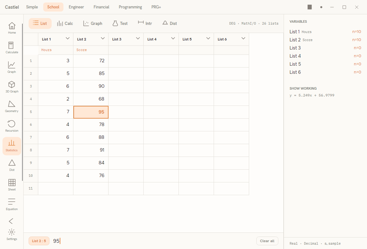
This chapter uses the List and Calc tabs. List is where the data lives; Calc is where the summaries appear. The other tabs - graphs, hypothesis tests, confidence intervals, and probability distributions - are covered in Statistics (School) and Probability distributions.
The Calc tab has three modes, chosen with the segmented control at its top right:
- 1-Var - summaries for a single column.
- 2-Var - summaries for a pair of columns (an
xand ay), including their correlationr. - Reg - regression: fit a line or curve to the
x/ypair and predict.
What the 1-Var summary reports. Select a column and switch to 1-Var, and the panel fills with a grid of labelled cells. Every measure from the concept sections above is here:
| Cell | What it is |
|---|---|
n |
how many values are in the column |
x̄ (mean) |
the mean (ordinary average) |
Σx |
the sum of all values |
Σx² |
the sum of the squared values |
sₓ (sample SD) |
the sample standard deviation (divides by n − 1) |
σₓ (pop. SD) |
the population standard deviation (divides by n) |
minX |
the smallest value |
Q1 |
the first quartile |
median |
the median (Q2) |
Q3 |
the third quartile |
maxX |
the largest value |
range |
maximum minus minimum |
The five-number summary is the minX, Q1, median, Q3, maxX row read together; both standard deviations sit side by side so you pick the one your situation calls for.
What the 2-Var and Reg panels report. 2-Var shows the mean, sums, and sample standard deviation for each of the x and y columns, then a joint block with Σxy, the count n, and the correlation r. Reg offers a row of model chips - Linear ax+b first, then curves such as Quadratic, Logarithmic, Exp ae^bx, and Power ax^b. Pick one and the panel shows the fitted equation, its r, r², and MSe (mean squared error, a measure of leftover scatter), and two prediction boxes: ŷ when x = estimates a y from an x you type, and x̂ when y = works the other way.
Worked examples
Example 1 - one-variable summary. Suppose a short quiz produced these seven marks: 12, 15, 15, 18, 20, 22, 27.
- Open the Statistics app and, on the
Listtab, type the seven marks down the first column, one per row. - Switch to the
Calctab and choose 1-Var. - Read the cells.
nis7. The meanx̄is(12+15+15+18+20+22+27) / 7, which is about18.43. Themedianis the fourth value once sorted -18. The five-number summary readsminX = 12,Q1 = 15,median = 18,Q3 = 22,maxX = 27, andrangeis27 − 12 = 15. - For spread, read
sₓ(sample) orσₓ(population). Because these seven marks are almost certainly a sample of a larger set of possible marks,sₓis the value to quote.
Notice the mean (18.43) sits a little above the median (18): the single high mark of 27 pulls the average up, exactly as the measures of centre section warned.
Example 2 - a line of best fit and a prediction. Now suppose you recorded, for six students, the hours each studied and the mark each scored:
| Hours (x) | 2 | 3 | 5 | 6 | 8 | 9 |
|---|---|---|---|---|---|---|
| Mark (y) | 65 | 70 | 78 | 82 | 95 | 98 |
- On the
Listtab, type the hours down the first column and the marks down the second. - Switch to
Calc, choose 2-Var, and readr. It is close to+1, confirming a strong positive straight-line trend: more hours, higher marks. - Switch the segmented control to Reg and pick the
Linear ax+bchip. The panel shows the fitted line - an equation of the formy = ax + b- together with itsrandr². - In the ŷ when x = box, type
7. The panel predicts the mark for seven hours of study by reading the line atx = 7. - Read
r²to judge how much to trust that prediction: the closer to1, the more of the variation in marks the line explains.
And the standing caution applies even here: this line shows that hours and marks move together for these six students. It is evidence, not proof, that studying causes higher marks - a sensible conclusion in this case, but one the number alone cannot establish. Correlation is not causation.
See also
- Statistics (School) - the full walkthrough of the Statistics app, including the Graph, Test, Intr, and Dist tabs.
- Probability distributions - the distribution functions behind the
Disttab. - Spreadsheet - the other place to hold columns of data, with live formulas.