Chapters
The School statistics workspace
The statistics workspace is where School mode handles data rather than single expressions. You reach it from the Statistics tile on the left apps rail. Instead of a keypad and a display, it gives you a set of list columns to hold your data down the left, a strip of sub-tabs across the top that swap what the right-hand region shows, and a summary panel on the far right. Everything else in the surface reads from the lists: the moment your numbers change, the summaries, the fitted line, and the graph update to match.
Use this workspace whenever you have a set of values - measurements, scores, paired observations - and you want to describe them (mean, spread, quartiles), find a relationship between two variables (correlation and a regression fit), draw a statistical picture (histogram, box plot, scatter), or run a hypothesis test or confidence interval. For a single number crunched on a keypad, use the School calculator; for a full grid with formulas, use the Spreadsheet. If you are new to the ideas of mean, spread, and correlation, read Statistics basics first, then come back here for the keys.
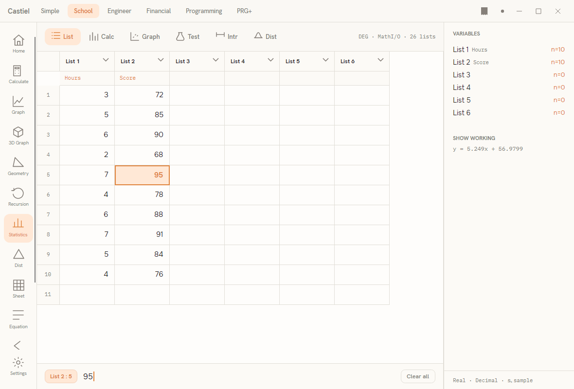
The window has three regions. Down the left is the list editor - a spreadsheet-like spine of columns named List 1, List 2, and so on, each with an editable header line under its name (a label such as Hours or Score) and a dense column of values. Across the top is the sub-tab strip: List, Calc, Graph, Test, Intr, and Dist. On the List tab the editor fills the whole width; pick any other tab and the editor narrows to a spine on the left while the chosen result region opens beside it. On the right is the Variables panel, which lists each column with the count n of values it holds, and a Show working area beneath it that echoes the current fitted equation. A footer line shows the active numeric mode.
Entering data into lists
All data lives in the list columns, and all analysis reads from them, so this is where every task begins.
Typing values. Select a cell - the entry bar shows its address as List c : r (column, row) - type a number, and press EXE. The value is written and the active cell drops to the next row down, so you can enter a column of readings without reaching for the mouse between them. The backspace key trims the entry bar as you type; the delete key removes the committed value under the cursor and pulls the values below it up (lists never carry gaps). Give a column a label by editing the header line under its name; that label then travels with the column into the summaries and graphs.
Column tools. Beyond typing, each column offers a set of actions for shaping data in bulk:
| Action | What it does |
|---|---|
| Sort ascending / descending | Reorders the column's values. |
| Fill | Sets every row of the column to one value. |
| Generate sequence | Fills the column with a run of values from a start, by a fixed step, for a chosen count. |
| ΔList | Writes the first differences (each value minus the one before) into another column. |
| Cumulative | Writes the running total into another column. |
| Running % | Writes each value as a percentage of the column's total. |
| Clear | Empties one column. |
| Clear all | Resets every list and header at once. |
The Variables panel on the right is your live tally: as you enter data, each list shows its running count n, which is the quickest way to confirm two paired columns are the same length before you fit or test them.
Calc: one- and two-variable summaries
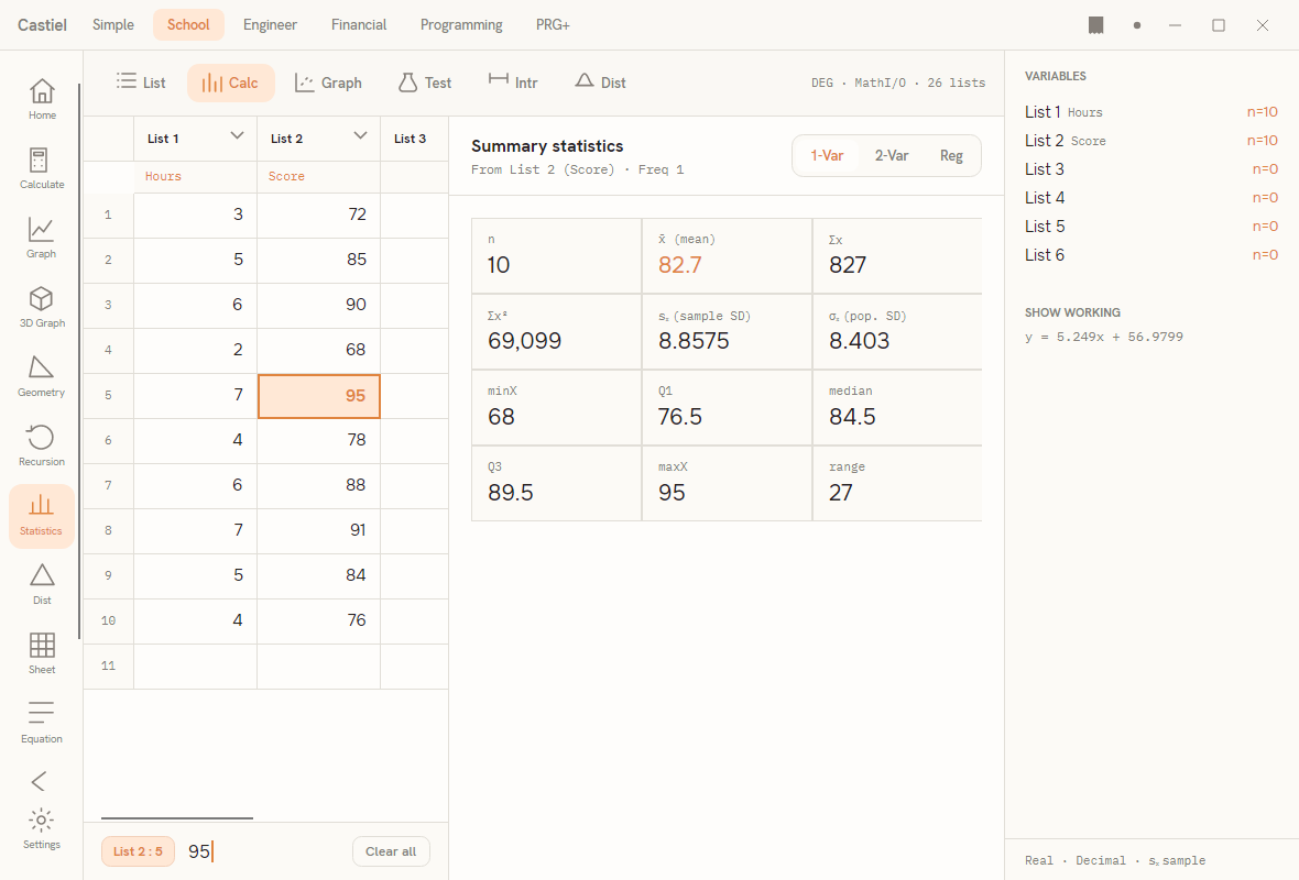
The Calc tab is the heart of the surface. Its header carries a three-way switch - 1-Var, 2-Var, Reg - that chooses which summary the panel builds. A provenance line under the title (for example, From List 1 · Freq 1) tells you which column is being summarised.
One-variable statistics (1-Var). This describes a single column as a grid of readout cells:
| Cell | Meaning |
|---|---|
n |
Number of values. |
x̄ (mean) |
The arithmetic mean. |
Σx, Σx² |
Sum of the values, and sum of their squares. |
sₓ (sample SD) |
Sample standard deviation (divides by n−1). |
σₓ (pop. SD) |
Population standard deviation (divides by n). |
minX, Q1, median, Q3, maxX |
The five-number summary. |
range |
maxX − minX. |
The two standard deviations sit side by side deliberately: use sₓ when your data is a sample drawn from a larger group, and σₓ when it is the whole population. The five-number summary is exactly what the box plot on the Graph tab draws.
Two-variable statistics (2-Var). With 2-Var selected, the panel reads a pair of columns (x and y) and splits into three groups: a VARIABLE X block (x̄, Σx, Σx², sₓ), a VARIABLE Y block (ȳ, Σy, Σy², sy), and a joint block below them with Σxy, the correlation coefficient r, and n. The correlation r runs from −1 to 1 and measures how tightly the two variables move together; it is the single number to glance at before deciding whether a straight-line fit makes sense.
Reg: regression fits
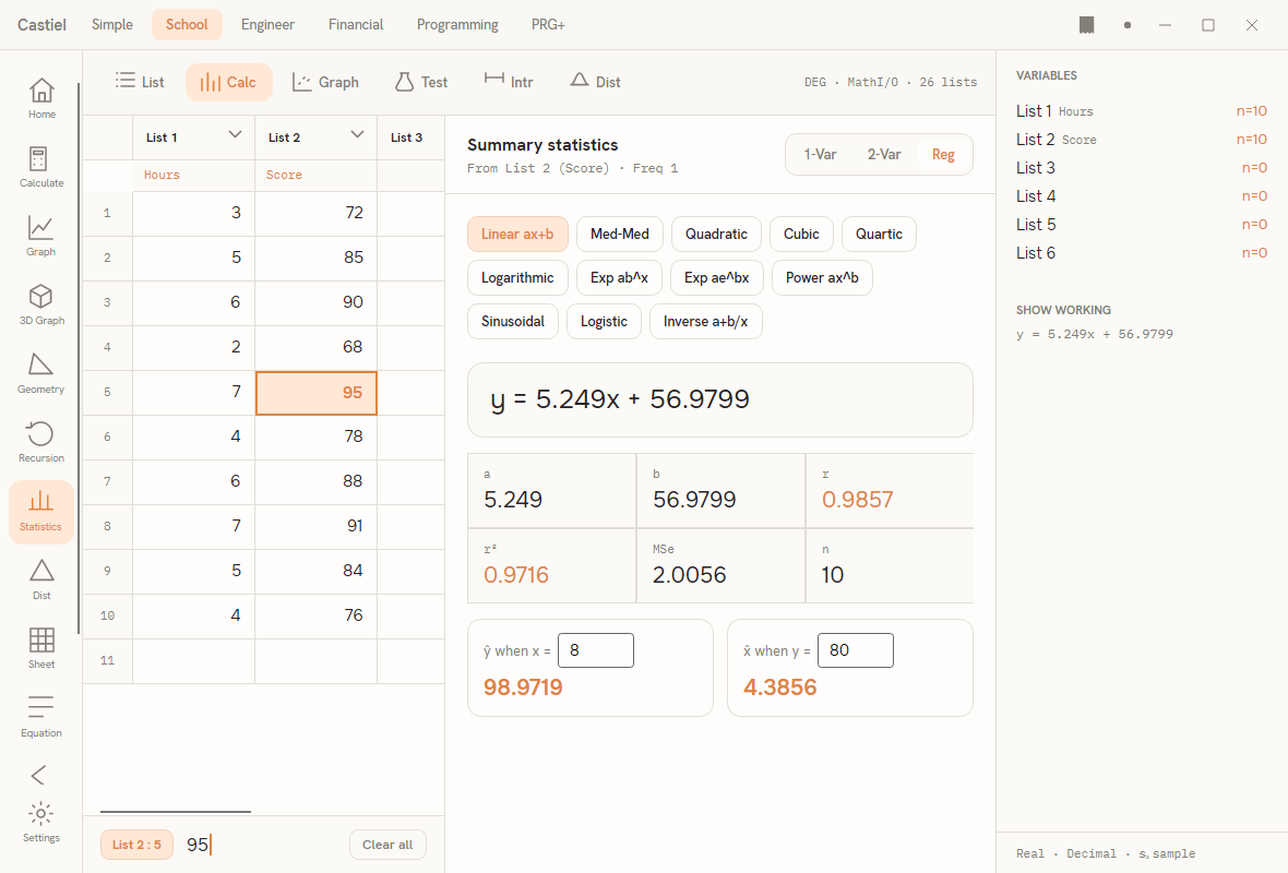
Switch the Calc header to Reg to fit a curve through the paired x/y data. A row of model chips lets you choose the shape of the fit:
- Straight line:
Linear ax+band the robustMed-Med(median–median) line. - Polynomials:
Quadratic,Cubic,Quartic. - Curves:
Logarithmic,Exp ab^x,Exp ae^bx,Power ax^b,Sinusoidal,Logistic, andInverse a+b/x.
Pick a chip and the panel shows the fitted equation in large type (for a line, something of the form y = ax + b), a grid of the fitted coefficients together with the correlation r, the coefficient of determination r², the mean-squared error MSe, and n. Two prediction boxes sit below: ŷ when x = estimates a y for an x you type, and x̂ when y = runs the fit backward to estimate an x for a given y (available for the line and the other single-valued models). If the chosen model cannot be fitted to the current data - too few points, or a shape the data will not support - the panel replaces the equation with a short Cannot fit this model notice rather than a misleading number. The fitted equation is also mirrored into the Show working area on the right.
Graph: statistical plots
The Graph tab draws the data instead of tabulating it. A row of chips selects the plot type:
| Plot | What it shows |
|---|---|
Scatter |
The paired x/y points, with a straight-line regression overlay when there are at least two points. |
xy-line |
The paired points joined in order of x. |
Box |
A box-and-whisker plot of one column, built from its five-number summary. |
Histogram |
The distribution of one column, binned automatically. |
Normal-prob |
A normal-probability plot, for judging whether a column is roughly normal (points near a straight line suggest it is). |
The provenance line under the title names the columns feeding the plot. Scatter and xy-line use the paired x and y columns; the box, histogram, and normal-probability plots summarise a single column.
Test and Intr: hypothesis tests and confidence intervals
The Test tab runs a hypothesis test; the Intr tab computes a confidence interval. Both work the same way: choose the type from the dropdown at the top, fill the input fields that appear (each is either a list picker or a typed value), and the result updates as you edit.
Tests (Test). The type list covers 1-Sample t-Test, 2-Sample t-Test, Paired t-Test, Linear-Reg t-Test, 1-Sample z-Test, 2-Sample z-Test, 2-Sample F-Test, χ² Goodness-of-fit, 1-Proportion z-Test, and 2-Proportion z-Test. Below the inputs you set the significance level α (default 0.05). The result panel leads with a plain-language verdict - Reject H₀ or Fail to reject H₀ at α = … - then shows the p-value and the test statistic in large figures, with df, the confidence bounds, and α in supporting cells.
Intervals (Intr). The type list covers 1-Sample t-Interval, 2-Sample t-Interval, 1-Sample z-Interval, 2-Sample z-Interval, 1-Proportion z-Interval, and 2-Proportion z-Interval. Here the trailing input is the C-Level (confidence level, default 0.95). The result reads out the interval's lower, point (the estimate), and upper values, plus the margin of error, under a heading such as 95% confidence interval.
If an input is missing or out of range, both tabs show a short Cannot run this test / Cannot compute this interval notice in place of a result.
Dist: distributions
The Dist tab evaluates probability distributions and is covered in full in Distributions. In brief: pick a distribution from the list on the left (Normal, Student-t, χ², F, Binomial, Poisson, Geometric, or Hypergeometric), choose a form with the PD / CD / Inverse switch, and type the evaluation point and parameters. The panel draws the curve or probability bars - shading the region up to your point for a cumulative query - and prints the numeric result beside it.
A worked example
Suppose you have five students' weekly study hours and their exam scores, and you want to describe the scores and then see how strongly hours predict them.
- On the List tab, put the study hours in
List 1: type1,EXE,2,EXE,3,EXE,4,EXE,5,EXE. Label the column Hours in its header line. - Put the exam scores in
List 2the same way - for instance58,63,71,75,84- and label it Score. The Variables panel should now shown = 5for both lists. - Open the Calc tab with
1-Varselected. The panel summarisesList 1:nis5,x̄is the mean study time, and the five-number summary (minX,Q1,median,Q3,maxX) describes its spread. To summarise the scores instead, point the one-variable summary atList 2. - Switch the header to
2-Var. The joint block reports the correlationr; for data that rises steadily,rsits close to1. - Switch to
Reg, leaveLinear ax+bselected, and read the fitted line off the panel - an equation of the formy = ax + b, withrandr²beside it. Type a value into ŷ when x = to predict a score for a given number of study hours. - Open the Graph tab and choose
Scatterto see the five points with the fitted line drawn through them.
Nothing here needed a separate "calculate" press: each list edit re-ran the summary, the fit, and the graph automatically.
Where the results go
Unlike the calculator, the statistics workspace is live - its panels always reflect the current lists, so there is no per-step tape of pressed keys. The Variables panel keeps a standing readout of every list and its count n, and the Show working area beneath it mirrors the current fitted equation, so the right edge of the window always summarises the state of your analysis. The footer line reports the active numeric settings. For the shared running log that spans the other School surfaces - and how to edit, correct, and export it - see the paper tape.
Related chapters
- Distributions - the
Disttab in full: densities, cumulative probabilities, and inverse lookups. - Spreadsheet - a full formula grid when lists are not enough.
- Statistics basics - mean, spread, quartiles, and correlation explained.
- The School apps - Calculate, Graph, Equation, and the rest of the rail.